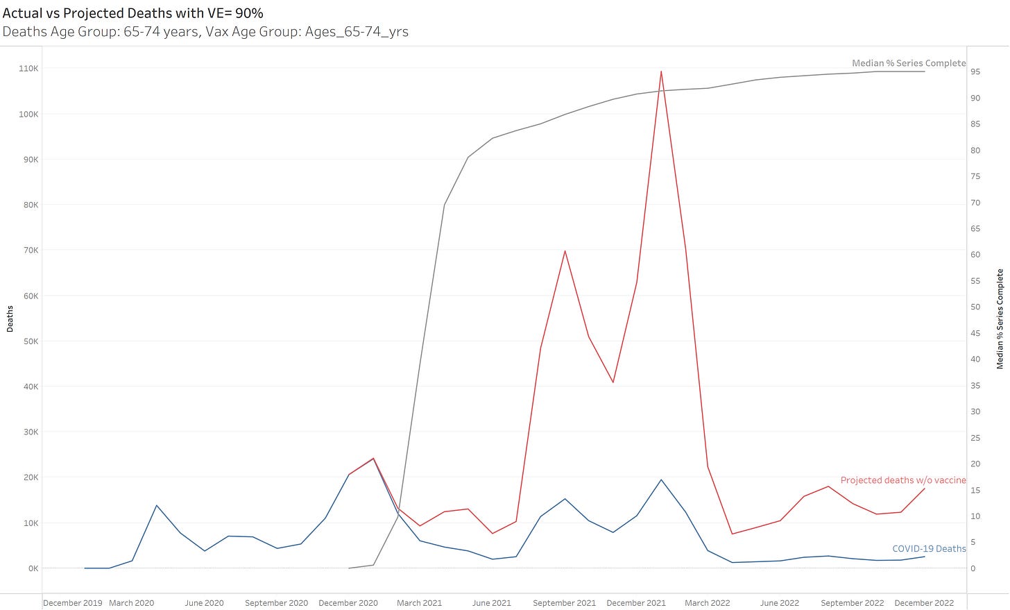
When the COVID vaccines were 1st announced, I actually assumed they would be pretty effective against COVID. The numbers from the trials looked very compelling & I was not in a position to question them. By late summer of 2021, however, I just could not square what we were actually seeing in the real world with what folks were claiming in terms of the effectiveness of the vaccines. One of my 1st posts on the substack was to look at what summer of ‘21 would have looked like if the vaccines didn’t exist, assuming the vaccines were 90% effective in reducing COVID Deaths…
Last week, I performed a similar “simulation” of a vaccine-less alternate history in the UK, given the UK’s recent estimates of VE….
Now I’d like to return to the US. For the US, I merry together the following data:
To create a projection of how many COVID deaths we could have expected in a vaccine-less world, we can use the following:
Note this equation adds “% pop vaccinated” to the formula I showed for the UK. This is because the UK stratified their data by vaccination status, so we could apply different VE’s for the different statuses (i.e. X for 2 doses, Y for 3 doses, 0 for unvaccinated). The US death data is not by vaccination status, so we take the total deaths for an age group and then use the % of that age group vaccinated (I am using “Series Complete” meaning >2 doses of mRNA or a single J&J dose) and an assumed VE for “Series Complete”.
Further note, the age groups for the COVID deaths data do not align directly with the age groups for the vaccination data (great work team 🤡), so I did the best I could to align them. Here is how the age groups were matched, along with a display of the Series Complete Vaccination % over time.
One age group that is good to analyze is the 65-74 year olds. This is a group that has a large amount of COVID deaths, and also the age groupings match between the death and vaccination data, so it’s a “clean” one to look at.
Here we look at what actually happened over time (blue line) vs. what a 90% VE against COVID deaths implies would have happened without the vaccine (red line) based on the vaccination level at various times (grey line). For clarity, I used the Median level Series Complete % for a given age group for each month.
The pre-vaccine most deadly month for this age group was January 2021, with ~24K COVID deaths. If we are to believe 90% VE, with a vaccination level of 91% in this age group in January of 2022, we would estimate January 2022 would have had ~109K COVID deaths without the vaccine, i.e. more than 4x the previous worst month. 🤨
If you would like to look at different age groups and play around with different values for assumed VE, you may do so in this dashboard:


More great work. It would be nice to engage with the calendar, for example just see projections up to Dec 21 or change the efficacy value after Dec 21 for Omi, but it's not that hard to just run two plots and combine them.
I like it, but wouldn't the pandemic have been over in Q2'2021?
I think so.
https://substack.pervaers.com/USA_Misc/Delta_Outbreak_Q3_2021.mp4
The ONS figures can not describe what happened in Q3'2021, because it seems to be pretty specific to the USA, unless you know another place where this happened.