A couple of items I read today led me down a path of looking into Red/Blue statistics again with regard to COVID.
First, Eugyppius has a post commenting on a piece by David Leonhardt in the New York Times where Mr. Leonhardt admits that its difficult to attribute differences in COVID outcomes to NPI’s or political affiliation. Nevertheless, Leonhardt had recently made a Red/Blue argument in a recent column and I have no doubt he’d be happy to again should he have the opportunity. I also learned from Hangtown Reasoning that Gavin Newsom in his State of the State speech last night stated the California had 35% fewer deaths per capita than Florida. A glaring omission in that comparison is adjustment for age (Florida has a lot higher % of seniors), but that will not be my focus here. Newsom clearly wanted to reinforce that wise Blue states and citizens did better than their ignorant counterpart Red states and citizens. You can be sure this framing will continue to be pushed by politicians and media members for the foreseeable future. But is it true? Did Blue states do better than Red states? Let’s take a look.
First, here’s the map of how each state voted in the 2020 presidential election:
From here, using data from the CDC, we can plot the COVID deaths/100K by Red vs. Blue states during the pandemic:
Given that voting patterns have a very clear regional correlation and we know that COVID seasonality differs by region, it’s not surprising that we see some patterns in the Red/Blue divide throughout the year. Walking through these charts:
2020: The 1st wave of COVID obviously hit primarily the Northeast which is exclusively Blue, thereby showing a much higher COVID death rate until approximately June. Then we see rates in Red (largely Southern) states jump significantly during their summer wave of 2020. Rates decrease in the late summer/fall, remaining above the Blue states, largely moving in tandem the rest of the year. Why did the remain higher in Red states? It could be lack of restrictions (doubt it), or could be that these states trend older and generally less healthy. What we can say for certain is that it was not differences in vaccination which was not yet widely available.
2021:
Through week 28 or so, we see very little difference in COVID death rates between Red & Blue states. If differences in vaccination rates are critical, it was not evident through the 1st half of the year.
Around week 30 is when we see the summer wave in Red states begin again. While the absolute difference in rates between Red & Blue is larger in 2021 vs. 2020 (peaks of 3.8 vs 1.5 in 2020; 6.1 vs 2.5 in 2021), the relative difference is was the same. Explain that, you say 😁. In 2020, the absolute difference was 2.3 COVID deaths/100K (3.8-1.5) and the relative difference was 2.5 (3.8/1.5). In 2021, the absolute difference was 3.6 (6.1-2.5) COVID deaths/100K, and the relative difference was again 2.5 (6.1/2.5).
Starting in late fall (~week 46) the rates are again indistinguishable.
It would be hard to attribute the difference in deaths in summer of 2021 was due to vaccination rates based on the following:
Why were Red & Blue states virtually the same in weeks 1-28 & from week 46 on?
Why is the relative difference between Red & Blue the same in summer peaks 2020 & 2021? Red states should have gotten relatively worse if 1) They had lower vaccination rates & 2) Vaccination rates were the critical factor of COVID death rates.
2022: The rates are essentially indistinguishable.
My conclusion from above is that the differences between Red & Blue states are largely explained by the fact that Red states seem to have 2 pronounced seasonal waves (Summer & Winter), while the Blue states primarily have a single large wave (Winter). A remaining question is why was the peak in summer 2021 so much worse that summer 2020? I believe at least part of the answer is related to what variants were present at the time of seasonal waves. Using data from Our World in Data, we can plot (starting in March 2021):
I’ve only included Alpha, Delta, and Omicron as those are the dominant strains during the period we have data. It sure looks to me like the terrible summer of 2021 was driven by Delta (both Red & Blue states had 60% or more COVID deaths in summer ‘21 vs ‘20).
Why do I think this is important to document? I hate the idea that this disease has punished “bad” behavior of certain people. When all is said & done on COVID, it may be the case that the overall results of Red states may look worse than Blue, and it that may be the case because the southern states had the misfortune of having their seasonal summer peak when Delta became the dominant strain in the US & Delta turned out to be much deadlier than other variants. I would say this is the hypothesis best supported by the data, rather than attributing it to any particular behavior.
Addendum: Anecdotes
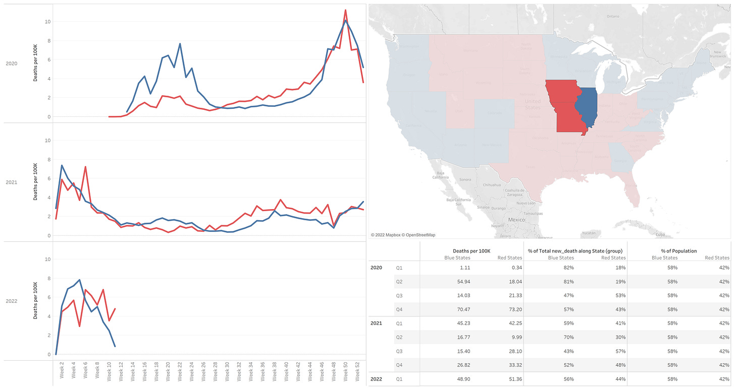
As I was exploring the data, I wanted to look at opportunities to compare Red & Blue where geography was not too large a of a confounder. Not so easy based on the geographic alignment of voting patterns, but a couple of anecdotes below. Doesn’t prove anything, but interesting cases.
Nevada & Colorado (Blue) vs. Utah & Kansas (Red):
Illinois (Blue) vs. Iowa & Missouri (Red):


I think you missed the memo. You're not supposed to *analyse* the data, because the Government has already provided you with all the information that you need! All tidied up and sterilised and ready to believe!
It's worth noting that "Didn't vote" would beat Trump or Biden in nearly every county.