It is not lost on me that the folks that write with perhaps a contrarian view on COVID related data coincidentally often have contrarian views on climate change topics. Guilty as charged! I believe the common theme is that we hear the official established narrative on a topic (“Everybody knows _______, those that don’t are deniers”) and it drives us a little crazy because 1) The data is almost always complex, causality is hard to infer, and the certainty with which people proclaim to be representing “the science” is almost always at odds with reality & 2) Calling someone a “denier” is meant to demonize, other, and shut up people with other opinions or interpretations of the data.
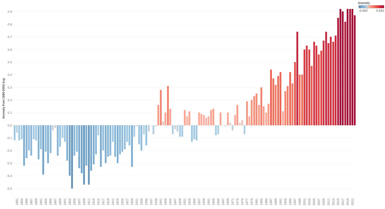
That being said, I’d like to make a simple point about the power of data visualizations using global temperature data. At this point we are all familiar with charts that look like this:
This chart is produced from data published from the National Oceanic and Atmospheric Administration. If you click on the link, you will see a chart that looks basically identical to the above. This chart shows the difference between average temperature in July for a given year, when compared to the average July temperature of the 20th century (15.8 deg C). So, for example, July 2022 shows a value of 0.92, meaning the average temperature was 16.72 deg C. Setting aside the issues with getting accurate temperature data across the world (and different ways these measurements are taken, etc.), let’s treat the data as 100% accurate. Looking at the above chart, one can see how a sense of deep concern, even paic, might befall many people.
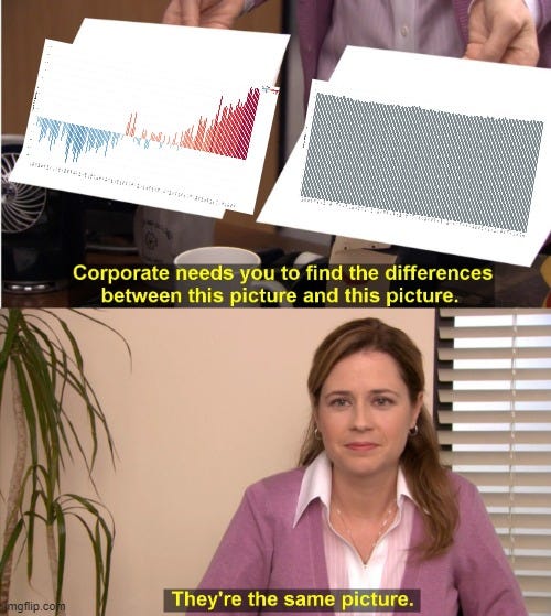
Now, let me present a second chart:
Guess what?
They are the exact same data. In the 1st chart, we show anomalies from the 20th century average July temperature & add colors so that it looks extra dramatic. In the second chart, we simply plot the average July temperatures over the years. I’m not saying that data should never be presented consistent with how chart 1 is presented… that may be a very useful and insightful way to view the data in many contexts (perhaps even this one). However, I do think you’d get a lot less people to freak out about climate change if you presented something like chart 2. Much like with COVID data, I worry that public officials and experts are carefully presenting data in ways to generate as much fear a possible in the public. Fear does not generally lend itself to calculated, rational thought, so we are ripe for some very bad policy decisions and actions when we are scared.


So basically, were coming out of a mini ice age and the temp is has raised by 1 degree since mini ice age. And we know this because they take temperatures in heavily heat absorbant exothermic areas such as cities and airports. Hmmm all sounds legit to me, someone pass me a CBDC and a carbon credited social credit score.
Yes, I think we need to educate ourselves about how all these magic tricks are done, so we won't be fooled again!