In my last post….
I used scatter plots and regression to show that the characteristics of US counties that had high uptake of the bivalent boosters were significantly different than those that did not in terms of income, smoking, obesity, physical activity, life expectancies and death rates. It occurred to me that not everyone is as comfortable speaking the language of scatter plots and regression, so I thought I would present the same data in a different way.
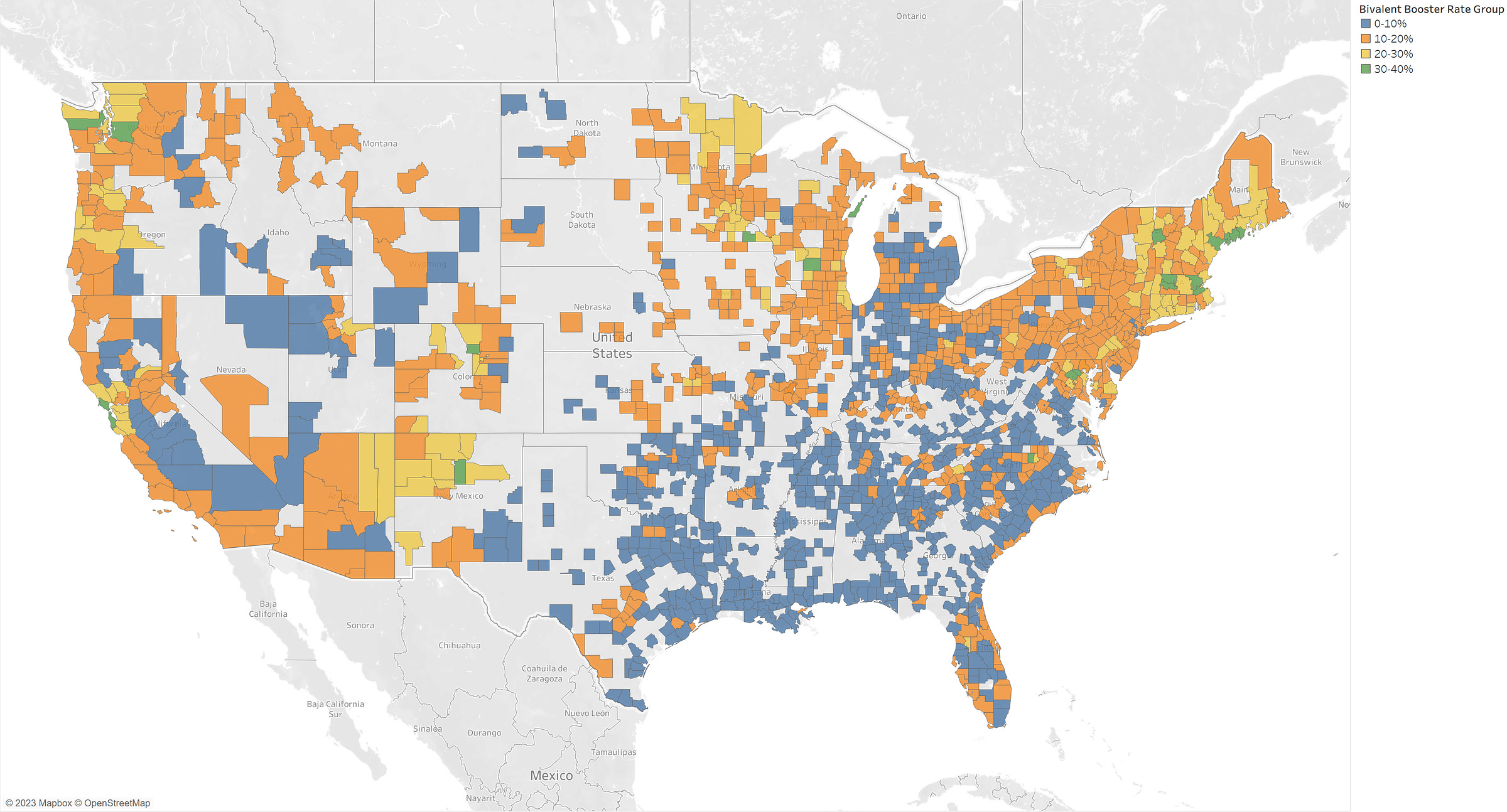
Again, looking at the counties with population larger than 25K people, I categorized the counties into whether 0-10%, 10-20%, 20-30%, or 30-40% of their population had received bivalent booster shots. We can think of these as low uptake, below average uptake, above average uptake, and high uptake. Here is a map of how those counties fit into the categories:
Now, we can look characteristics of the counties by booster rate group:
In each group we can see the median % of population that have taken a bivalent booster, the number of counties in that group, the median population of those counties, total population of that group and % of the total population. So we see, the low uptake group has a median of 7% uptake, 768 counties, totalling ~94million people, 30% of the total, and median county population is ~50K. As you can see, as the uptake increases, we have fewer, but large counties. Roughly half of the population is in the “below average” category.
Now to look at the median statistics at those groups that are sure to play a role in general health outcomes. I will highlight the differences between the lowest bivalent boosted counties and the highest. From above table, you can see that the numbers in between those two follow the same pattern:
Median Household Income: Low booster is $51K, high booster is $77K
Median % Adults with Obesity: Low booster is 36%, high booster is 23%
Median % Physically Inactive: Low booster is 30%, high booster is 16%
Median % Smokers: Low booster is 23%, high booster is 14%
Median Age-Adjusted Death Rate: Low booster is 445, high booster is 233
Median Life Expectancy: Low booster is 76, high booster is 82
Obviously places with high booster uptake are different in many ways from the low booster uptake places. Do not take seriously any study or statistics looking to claim efficacy of bivalent boosters (remember these were only tested on mice) that does not take into account the differences in the people taking these boosters.
Update- boosters and politics
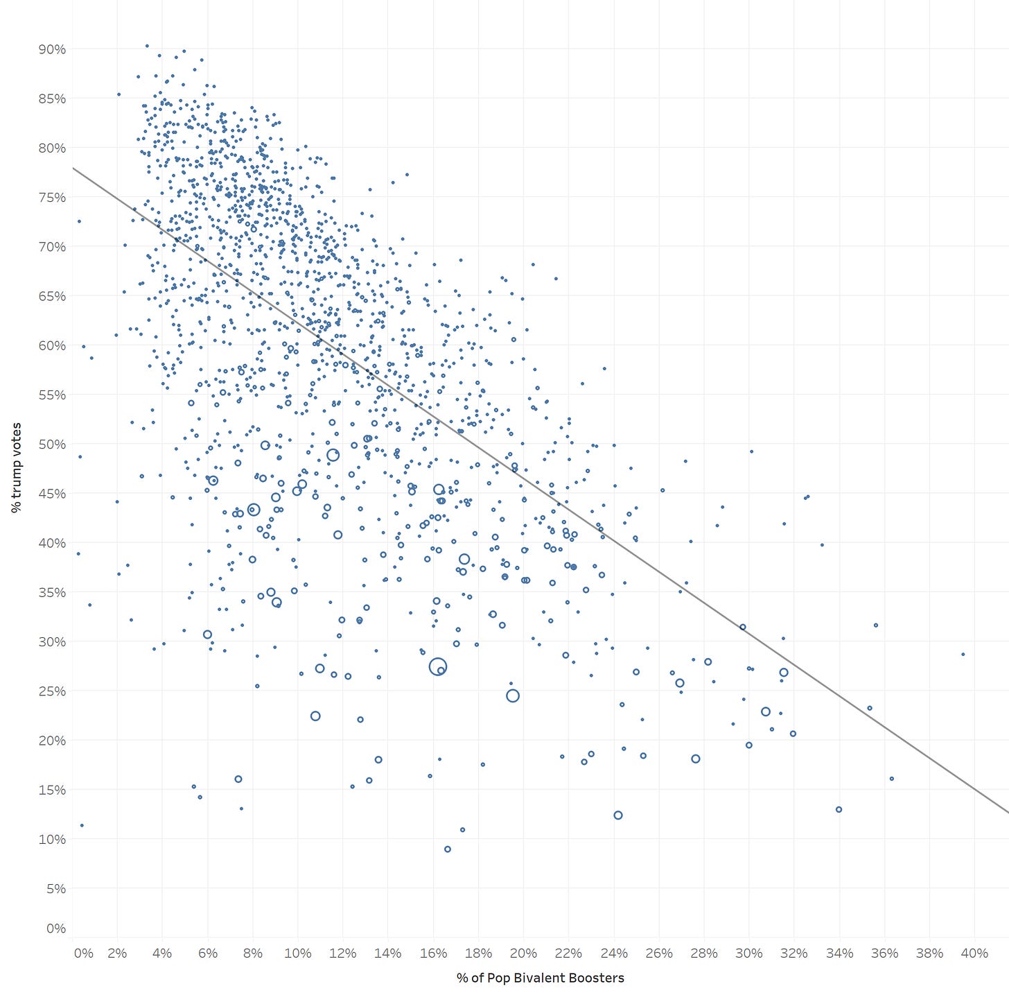
To Nancy’s question in the comments. Unsurprisingly, there is a strong correlation between bivalent booster uptake and politics. Below I show side by side maps of bivalent booster uptake (blue=high, red=low) on the left & % of Trump votes on the right (blue= low, red=high):
As a scatter plot, we have:


It's almost funny how medical professionals and others simply assume the correlation between vaccination and outcomes at a population level is causal.
Age is still the strongest predictor followed by obesity and other co-morbidities. Has there ever been an RCT of the vaccines on a group of over 60's controlling for these confounders???
I'm curious how closely the booster uptake map aligns with democrats/republicans population stats.