A new way to view COVID and mortality data
Comparing results during different levels of vaccination
WARNING & DISCLAIMER: Below I have tried to get into some significant depth on the creation of an updated dashboard looking at worldwide data. There are some non-obvious calculations required when you allow folks to aggregate data together from any collection of countries. For those not interested in getting into the level of detail I go into below, please feel free to skip this post. I will be posting some less technical observation in my next post, which should be up momentarily.
Many months ago I did some exploration of the data produced by Our World in Data in which I looked at the very different trends in COVID related outcomes pre & post vax in different geographies.
I have circled back to that same dataset to view the data in a different way. In course of doing this, I updated the dashboard that utilized this data. Allow me to explain the revised dashboard.
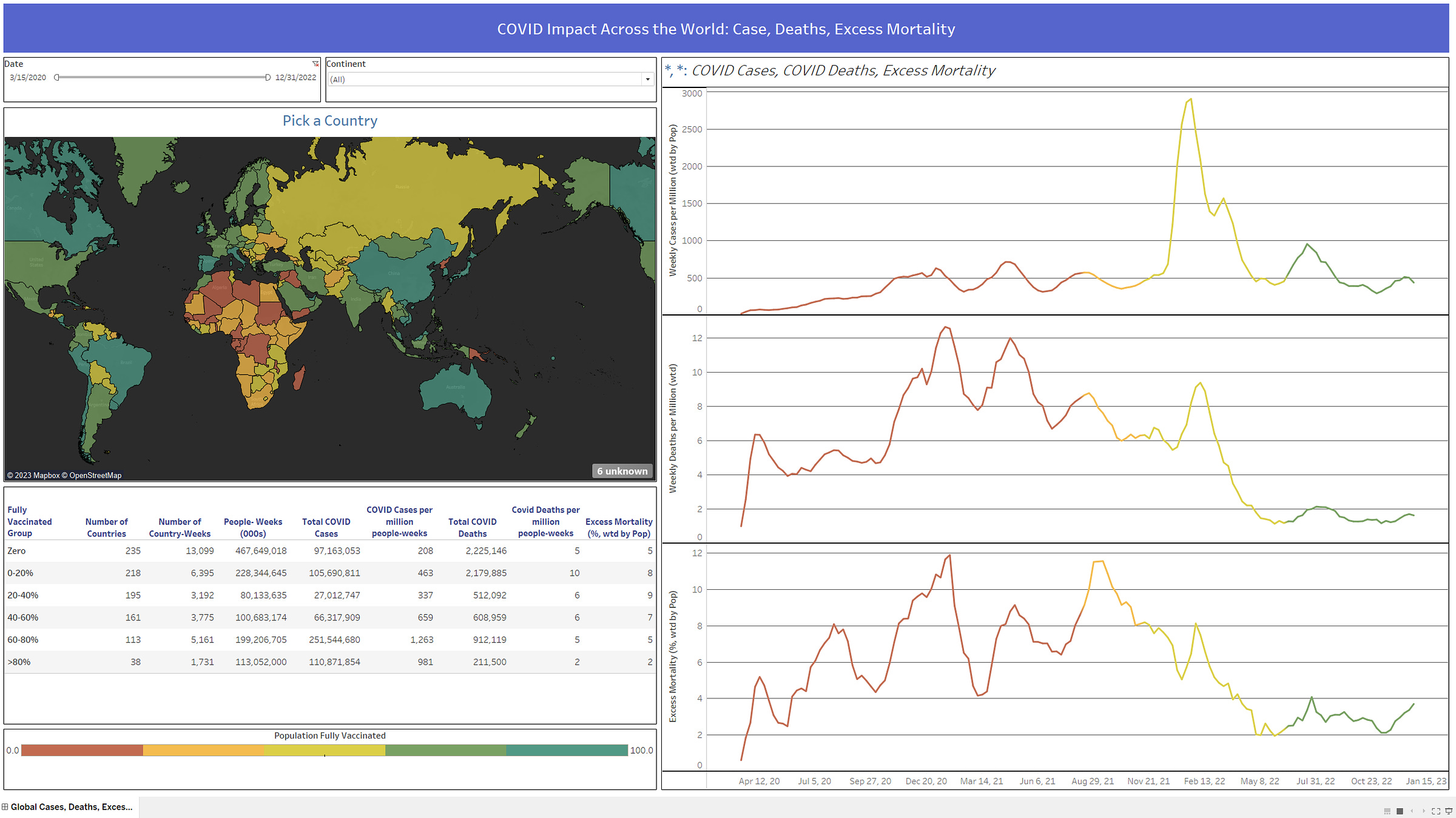
Here is a view of the finished product:
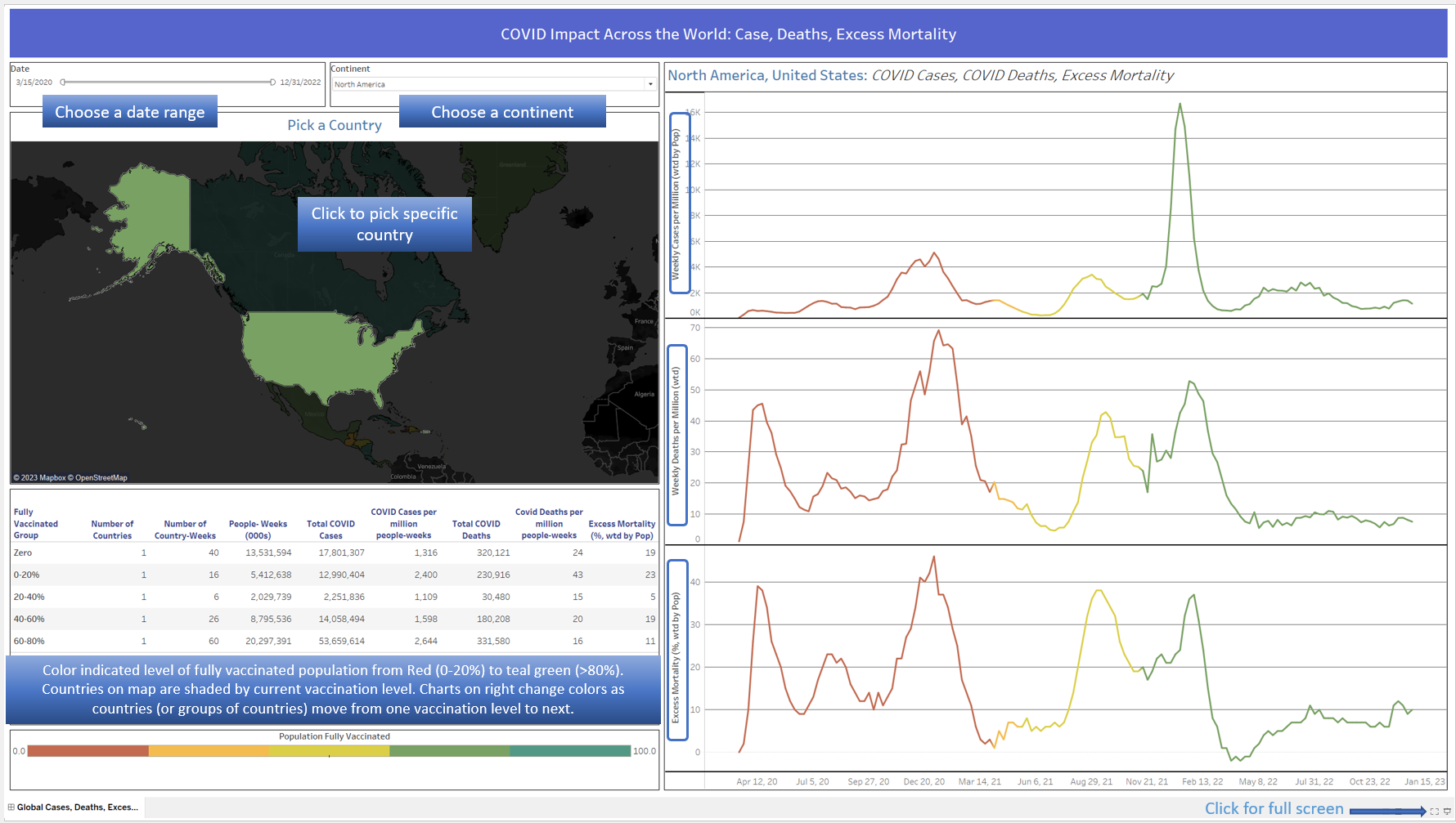
And now, allow me to add an annotated version to explain what we have here:
As with all of my dashboards that are shared publicly, it is best to view on a larger monitor & to go to Full-Screen mode (lower right is a button to do so). As you can see, on the upper left half of the screen you can filter the date range you would like (defaulted to 3/15/20 → 12/31/22 to try to capture start of COVID, and assuming recent data may not be complete). You can then click on a country(s) to drill down to a specific country. So, you can view the entire world, a specific continent, or any collection of countries (or single country) as desired.
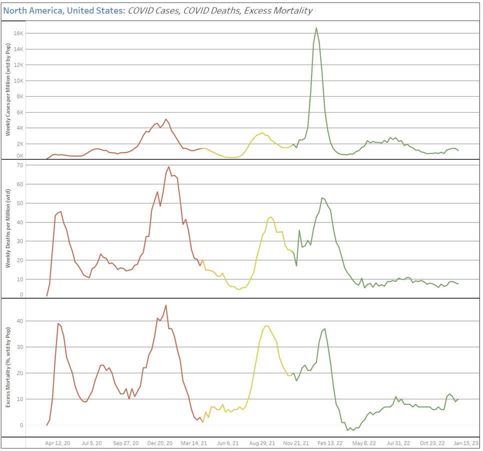
The map, table, and charts on the right will update according to your selections. The colors that shade the countries on the map & also that are on the line charts on the right are synched and correspond to the % of population that is fully vaccinated. The shading of a country on the map indicates the fully vaccinated % of the country as of the last date in your date range (by default 12/31/22). The vaccination levels have been divided into 5 categories, starting in RED for 0-20%, ending in TEAL from 80-100%. In the charts on the right, you can see the color changes over time for a given selection on countries, which indicates it transitioning into a new level of vaccination.
Both the tables and the charts will work with anywhere from a single country, all the way up to the world. Frankly, the tricky part of creating this was enabling the user to choose their geographic level of detail & have the values still make sense. Let’s start with the charts on the right.
You see 3 charts (each are providing weekly numbers), starting from the top is COVID cases per million, then COVID deaths per million, and finally Excess Mortality (as a %). Plotting these is pretty straightforward for a single country, but when you are mixing data together from multiple countries is tricky. For all the measures on these charts (color indicating vax %, cases/million, deaths/million, avg. excess mortality (%)), we use weighted averages (weighted by population) to calculate values. Examples:
Suppose we selected the UK & France to be shown together. These two countries have roughly the same population, so the result you will see is very nearly the average of the data of the two countries. I.e. if UK has a 60% vax rate, and France a 70% vax rate during a certain week, my chart would show ~65% (more precisely, Our World in Data says France has 67.8M people and UK has 67.5M people, so the weighted avg would tip towards France, going slightly above 65%).
A more extreme example is if we decided to showcase the United States and Peru. The US has very nearly 10x the population of Peru, so if I were to show these two countries (and only these two countries) together, the US data would be weighted 10x as much as the Peru data, meaning the combined data would look quite similar to just using US data on its own.
Note that I have given examples with only two countries at a time, but we can create a weighted average for any number of countries, we simply expand the idea of weighing a given countries data according to how large that country is relative to the whole.
Ok, so now onto the table:
This table is just for the US. Each row represents a different level of vaccination (again, in 20% chunks). When selecting a single country, we can really focus on the 5 columns on the right. Here we see, for each level of vaccination, Total COVID Cases, COVID Cases per million/ week, Total COVID Deaths, COVID Deaths per million/ week, and Average Excess Mortality during that period. Where this gets a bit trickier is if we want to look at multiple countries. Here is US & Canada together:
Now, let’s pay attention to columns 2-4. The Number of Countries tell us how many of the countries were ever at that level of vaccination (e.g. both US & Canada has gone form 0 to 60-80%, but only Canada has gotten above 80%). The Number of Country-Weeks is best explained with example… the US had 40 weeks of zero vaccination, while Canada had 43 weeks with zero vaccination, so total Country-Weeks is 83. The People-Weeks(000s) is simply the population of a country x how many weeks they were at this level of vaccination, then summed across countries. So, in this case, for the Zero vaccination level, we count the US population for 40 weeks, and the Canadian population for 43 weeks. The People-Weeks then are used as the denominator in columns 6 & 8 (COVID Cases per million people-weeks, Covid Deaths per million people-weeks). I believe this is the fair way to combine different countries, weighing their data both by how large their population is, and how long they stayed in that vaccination level.
This post was a lot more involved that I thought it would be. Please do comment with questions, suggestions, mistakes, etc. And if you want to play around with the dashboards, again, they are available here: Global Data from OWID


Great addition!
Am I doing something wrong as far as trying to scroll the map? I have to zoom-hop to move around (Safari and Chrome). Possibly more of a Tableau question / issue.
Excellent work with the dashboard.