


Who is dying with COVID in the UK?

After updating my dashboard with the most recent two UK Vaccine Surveillance Reports (covering weeks 2-5 of 2022), I played around to look at the data in a new way. While looking at various metrics in rates/100k of population can be very useful, it is easy to lose sight a bit of some of the absolute numbers. Namely, when we think about cohorts of people by age and vaccination status, it is instructive to see what the population size is of the various groups and how many people are dying in each group. This plot seems revealing:
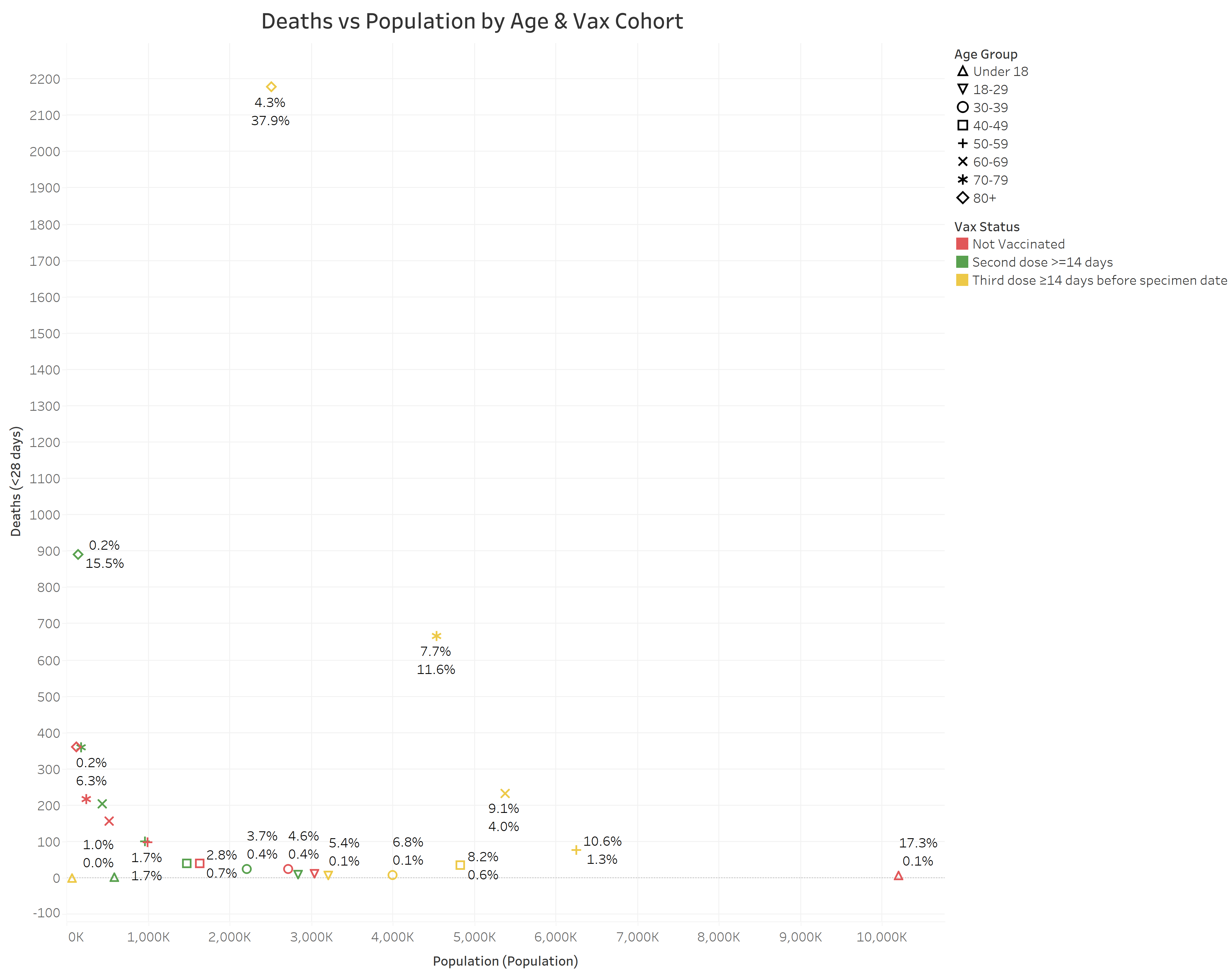
Let’s explain the above. Each mark on the graph represents a combination of age & vaccination status. The age group is indicated by different shapes, while the vaccination status is indicated by color. For example, the point to the furthest lower right, a red triangle, represents the Under 18, Not Vaccinated group. The x-axis is population, while the y-axis is Deaths (<28 Days). So, further to the right means more people, further up means more deaths. The two numbers near a mark show the % of that group’s population out of the total, and the % of that group’s deaths out of the total respectively.
Observations:
The group with the most deaths (38% of all deaths) are triple-dosed 80+ year olds, which compromise 4.3% of the UK population.
Next up in terms of deaths are double-dosed 80+ years olds with 15.5% of deaths & 0.2% of population.
3rd in deaths are triple-dosed 70-79 year olds. A much larger population (7.7%), contributing 11.6% of deaths.
Harder to see (and the numbers don’t display due to overlap), but the 4th highest death cohort is the double-dosed 70-79 year olds who make up 0.3% of the population and contribute 6.3% of deaths.
Tallying up the above, the double & triple-dosed 70+ population is 12.5% of the population & makes up 71.3% of all COVID related deaths.
Meanwhile, the largest population cohort, the <18 year old not vaccinated, are 17.3% of the population and 0.1% of the deaths.

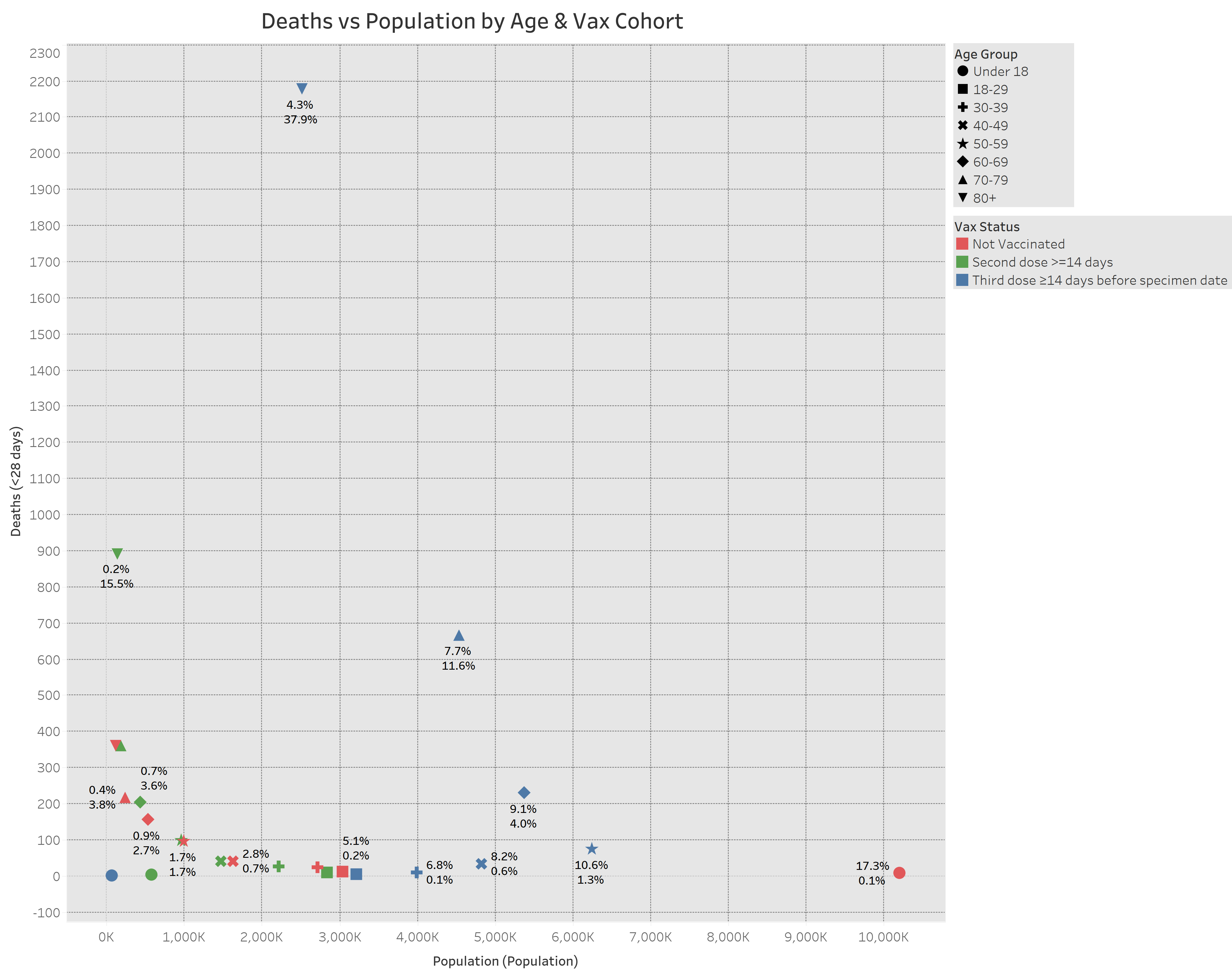
Alternative graph:
A reader suggested the chart colors made it hard to view, is this better?
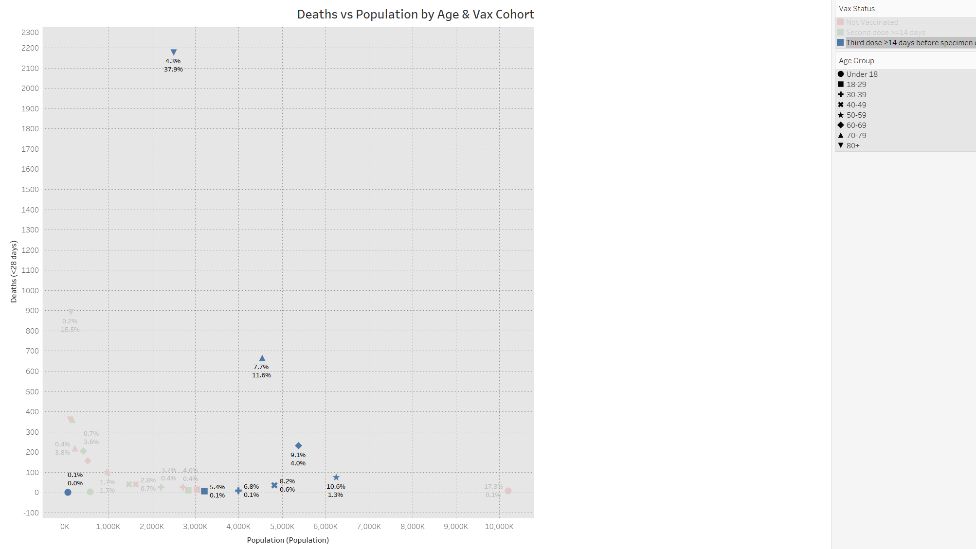
Split into 3 for easier viewing:
Not Vaccinated:

2nd Dose > 14 days:

3rd dose >14 days:
Amazing analysis to so clearly represent all that data in one graph. It would be interesting to reduce each age/vax cohort to a probability. A review of my age group seems to indicate increasing risk with more jabs. I wonder if that's consistent across all age groups.
This really helpful and many thanks! Is there any statement you can make about the 29% vax status for the <70 or working group where the USA insurance companies are seeing such a dramatic rise in mortality? We cannot trust USA numbers or classification. Thank you again!