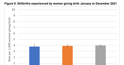
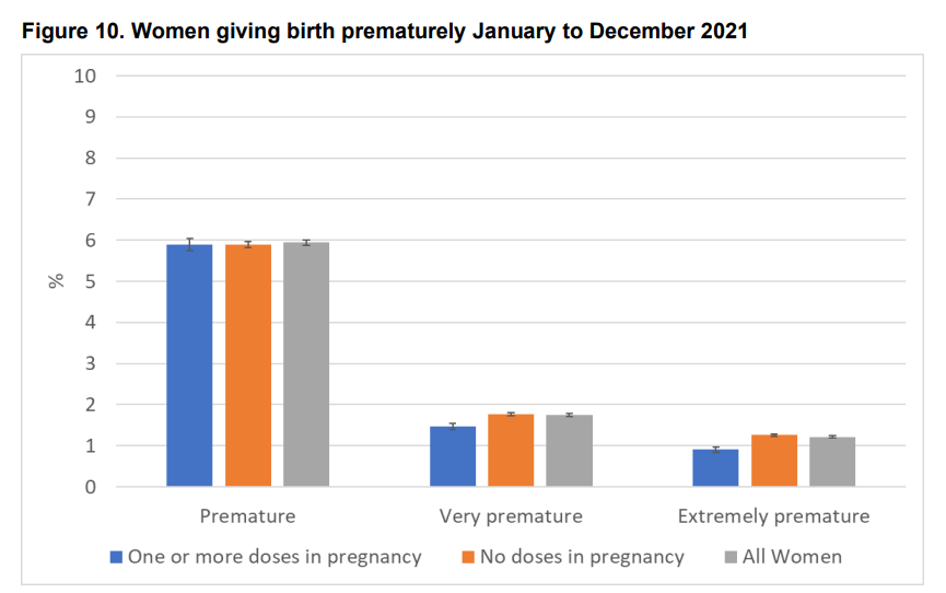
I must admit that as much time as I have spent looking at the UKHSA reports & in particular the section on vaccination and pregnancies, I have never spent much time on the included bar charts. You can’t get the exact metrics from those charts and they are not very interesting, so I generally just ignored them and moved on to the sections that had actual numbers I could use. For whatever reason, I paid more attention this morning to the charts in this week’s report (note, I believe the charts have been the same since 2022 Week 8, it is now week 17). Let me post a couple of those charts here.
Can you spot the problem? Maybe this will help.
“All Women” have higher stillbirth rates and rates of Premature births than BOTH “One or more doses in pregnancy” women and “No doses in pregnancy” women. This is odd & in my mind, per the title of this post, points to either incompetency at the UKHSA or as a possible warning signal.
Incompetency explanation: If All women is supposed to the be aggregation of “One or more doses in pregnancy” and “No doses in pregnancy”, then what we are seeing above would be mathematically impossible. That’s not how weighted averages work. If the All Women is an aggregation of the other two groups, then it must be the case the aggregate metric falls somewhere in between the metrics of the two subgroups.
Alternative (worrying) explanation: Perhaps due to imprecise language (as we’ve seen before in this report), the above charts are missing a 3rd subgroup. Perhaps, women who received doses before their pregnancy but not during their pregnancy are not included in either subgroup above (although I would argue those women, by strict language, should be included in “No doses in pregnancy). If this were the case, we might be a bit concerned. Why? Well, we know that this is a relatively small group of women & if the metrics from that small group of women are high enough (in stillbirths and premature births) to raise the All Women metric above both the subgroups above, then that group of women must have pretty damn bad outcomes. This could indicate that women receiving a vaccine dose before pregnancy did significantly worse than those receiving doses during pregnancy and those who have received no doses.
I suppose a variant of the second explanation is that there is an “Unknown vaccination status” cohort that is not being reported. But again, that should be a small group and would necessitate that the “Unknown” group was doing significantly worse than the other.
A full release of the detailed data would allow us to better understand what is going on here. I’m not holding my breath.


Where did they file the women who either miscarried or gave birth prematurely *within two weeks of the shot*? Depending on the biases of the bean-counters, they could have gone in any of those columns...
I wouldn't rate the graphs as solid evidence of a high rate among the dosed-before-group. But at the same time, this is the group I have anticipated might show a fuller impact from injection, whereas the potential auto-immune response from the vaxx might be attenuated if received during pregnancy. So these numbers could be bad. We won't know until someone actually publishes them.
There could also be some math funniness with the still-pregnant groups adding to the denominators but I wasn't able to model it out as easily as I thought, so that's a wild guess.