Today El Gato Malo, praise be unto him, wrote a piece on the how an economist was potentially being misleading in a chart showing the number of excess deaths per capita by state vs. the number of shots per person.
Here is the screenshot of the tweet that El Gato uses as his launching point
My comment in El Gato’s post was that I found the choice of the time period June 2021 - Q1 2022 immediately suspicious. Using this period, we capture the summer of 2021 which was terrible for southern states during the Delta wave (and also tend to have lower vaccination rates…. that doesn’t mean that summer was terrible because of the low vax rates). Essentially, the time period chosen includes 2 seasonal waves for the south (summer ‘21 & winter ‘21-’22), while generally the northern states would have only had a single seasonal wave in the winter of 2021-22.
To test my hypothesis, I wanted to re-create the above chart & then see what it looks like in different time periods. So, I went and picked up the latest vaccination data by state from Our World in Data and excess death information by state from the CDC. With those two pieces of data, I chart the % of people in each state fully vaccinated (should be very similar to Pollak’s use of doses administered per person) vs. % of excess deaths above expected deaths. Here is the view of that chart for June 1, 2021- March 31, 2022 (the presumed time period Pollak uses)
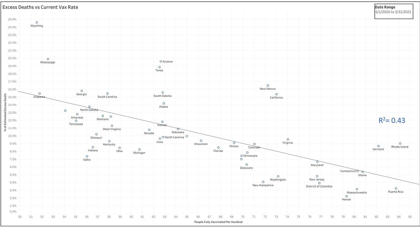
You’ll notice that we see evidence of correlation between higher vaccination rates and reduced excess death (downward sloping line). My R-squared is quite a bit lower than Pollak’s, which I believe I have an explanation for (stay tuned), but on its face, this would still count as significant correlation that could be investigated further. Let me stay on the topic of the choice of time period for now. One simple test is to see if the same picture is present in another time period where we do not expect the vaccine to have had a major impact. To control for seasonality, etc., I will rewind exactly one year. Let’s look at excess deaths between 6/1/2020 and 3/31/2021 vs. the current vaccination rates. We would not expect vaccination to have a major role during this period… most of the period a vax was not available, and the program was just rolling out during the last few months of this period. Here is same chart, different time period for excess deaths:
As you can see, the correlation between July 2022 vaccination rates and excess deaths Jun ‘20- Mar ‘21 is far higher than Jun ‘21- Mar ’22. This basically destroys the good professor’s point.
Now, onto the 2nd point. Why is the R-squared of my 1st chart only 0.18 when for what should be a very similar chart, Pollak is showing an R-squared of 0.41? He uses doses/person while I use % of people fully vaccinated. Those 2 measures should align quite closely and not result in Pollak finding such stronger correlation than I did. I believe the answer is in what we use on the y-axis. I use % of deaths above expected number of deaths (which I believe aligns with what the CDC does), while Pollak uses number of excess deaths per capita (per 100,000 people is how he charts it). I would argue that he is certainly wrong to do so. Hopefully this is not intentionally dishonest, but just a sloppy error. Let me provide an example of why I believe my method is the correct one. Suppose a fictional world where we have 2 states:
State 1: Geezerville. Population 100. All residents are 88 years old.
State 2: Youngstown. Population 100. All residents are 28 years old.
Based on the age of the residents, in any given year, we would expect 8 people to die in Geezerville and 1 person to die in Youngstown. A pandemic comes through both states. In a single year, 16 people die in Geezerville and 2 people die in Youngstown.
T Coddington’s math:
Geezerville: 8 excess deaths, 8 deaths were expected → 100% excess deaths
Youngstown: 1 excess death, 1 death was expected → 100% excess deaths
Pollak’s math:
Geezerville: 8 excess deaths, population of 100 → 80 excess deaths per 1,000
Youngstown: 1 excess death, population of 100 → 10 excess deaths per 1,000
So, while I would argue Geezerville and Youngstown performed similarly through the pandemic in terms of excess deaths, Pollak would argue that Geezerville did 8x worse. I'd say that’s terribly misleading.


I live in Geezerville. Lol
I point out similar here (this time with "covid deaths") in this piece I wrote for Panda, inspired by Ethical Skeptic.
https://www.pandata.org/a-picture-tells-a-thousand-words-or-does-it/