How long do the vaccines prevent hospitalization?
Looking at YoY Hospitalization Vs. Timing of Pop Vaccination
Looking at the macro trends of Covid in the US over the last several months, I have become increasingly skeptical about the overall efficacy of the vaccines. With so many folks vaccinated, how can it be that we are seeing increased cases, hospitalization, and deaths vs. same time this year? There are very qualified doctors who I follow on twitter (e.g. @DrJBhattacharya , @TracyBethHoeg , @VPrasadMDMPH , @MartinKulldorff) who continue to show strong confidence in the vaccines ability to prevent serious illness and death (~90%), but I honestly can’t square that with the numbers we are seeing. If >60% of the population is vaxxed and we are seeing worse numbers this year compared to same time last year, that would imply the unvaxxed are getting sick at a rate multiple times as last year. I haven’t heard a plausible explanation why that would be.
So in what follows I try to examine (from a macro level) if vaccines are working and for how long.
Starting assumptions:
Covid is highly seasonal by region. In other words, areas in the same geographic region see rises and declines at similar times. Invite you to follow any number of folks on twitter to see this demonstrated, e.g. @Hold2LLC
Because of this, as a 1st approximation, we would expect for a given area, at a given time of year, the number of cases, hospitalizations, and deaths to be similar from one year to the next.
Data to explore:
I believe the most reliable data to use to understand serious disease from Covid is the hospitalization data at HealthData.gov (US Hospitals Time Series) . There are many metrics in this data set. I am simply going to use “Inpatient Beds Used Covid” as representative of the situation.
For vaccines, I am using CDC data US Vaccinations . I am going to use “Series Complete 18Plus” (i.e. adults fully vaccinated) as my measure to investigate.
I will limit myself to the continental US, and I am removing UT, CO, and TX. TX vaccinations are not included in the CDC data, and UT & CO both appeared to “dump” a bunch of vaccinations on a single day in July/Aug and therefore I think including them skews the picture.
I will look at the 6 months of April-September. We should have reasonably good data for these months in both 2020 and 2021 and vaccines had been in effect for several months by April of 2021.
So, let’s start by looking at hospitalizations overall for the 45 states included:
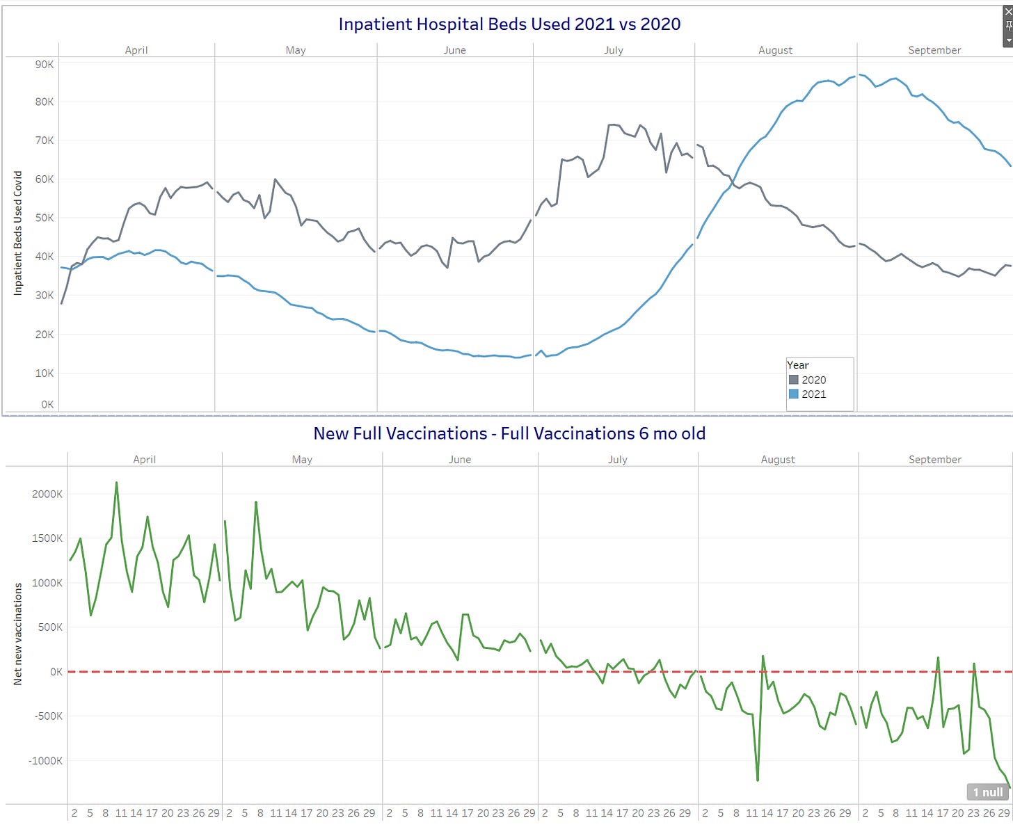
We see that at the beginning of April 2021, we had a bit more people in the hospital than at the beginning of April 2020. This is intuitive as Covid was just ramping up at this time in 2020 and we were coming out of the tough Covid winter of 2021. By the end of April, we see significantly more people sick in 2020 vs. 2021. We then see the two lines stay roughly parallel, but continue to get slightly further apart through mid July. This pattern would be consistent with the idea that they are following the same seasonal pattern (i.e. the shape of the curve), but the vaccine is making the level lower in 2021, and as we keep vaccinating people, that continues to decrease the overall level. But then we see something happen in mid-July. While in 2020, we see an inflection point where hospitalizations start decreasing, in 2021 we see them continue to rise, eventually crossing over in early August. The open question is why?
A consistent hypothesis, in my opinion, is that the vaccines prevent serious illness for a time, but fade and eventually are not effective. Therefore, people who were vaccinated some time ago will eventually “re-enter” the danger zone and are susceptible to serious illness. So I seek to test a simplified version of this scenario. Suppose, we acted as though the vaccine was perfect for 6 months, but at six months + 1 day, you were essentially unvaccinated. With this premise, on any given day we would have new vaccinations entering the “vaccine-protected” group, and and people who were vaccinated 6 months ago exiting the “vaccine-protected” group. We can therefore plot the changes to the vaccine-protected group over time. What do we see?
Notice that we are adding people to the vaccine protected group consistently until ~mid-July. At that point, more people’s vaccines are “expiring” on a daily basis then there are new people being vaccinated. In other words, if we were to assert that only people who were vaccinated < 6 months ago are protected, then we can say that the unprotected population started increasing in mid-July, just about the same time that the hospitalization numbers started to follow different patterns in 2021 vs 2020.
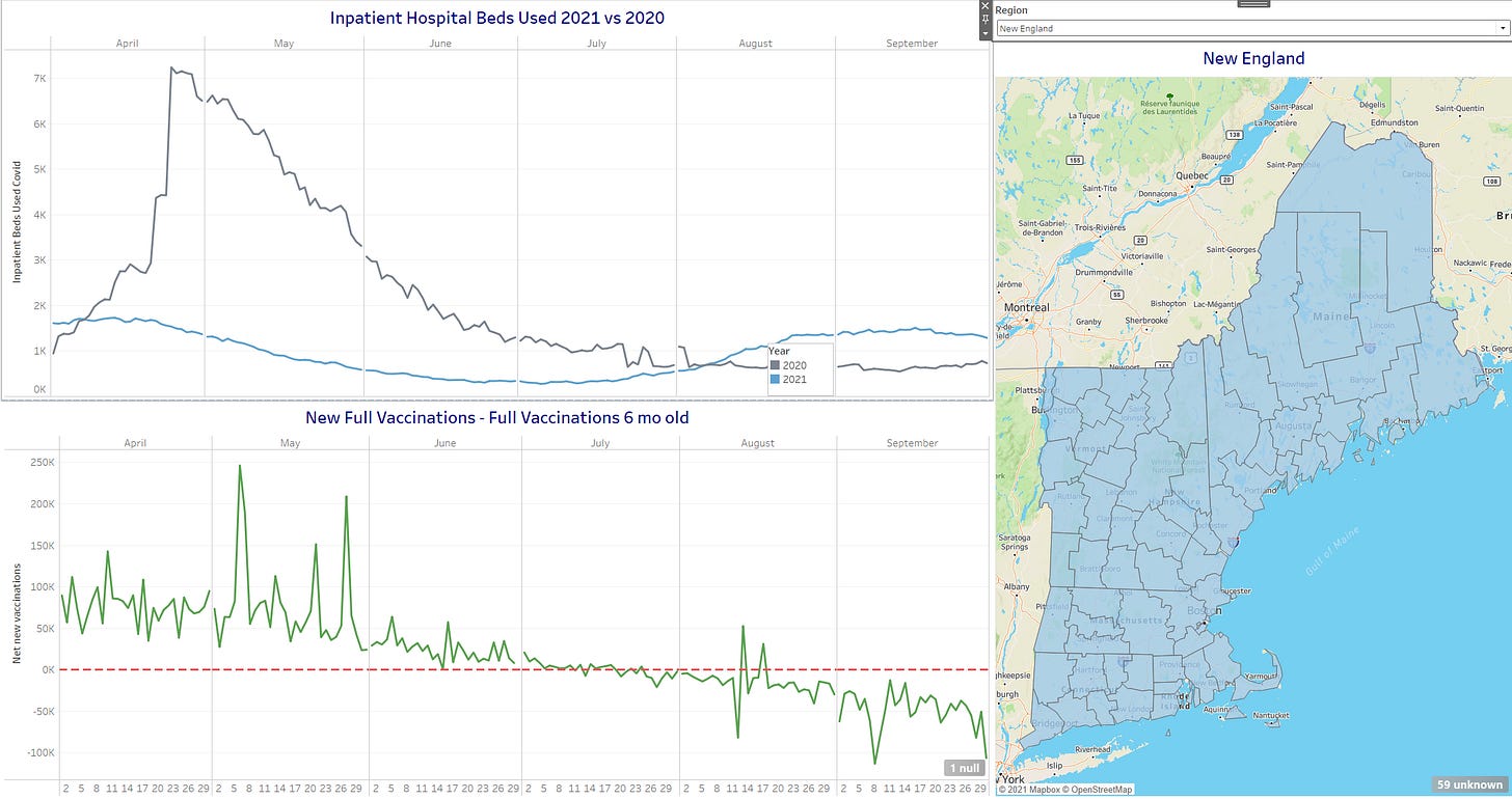
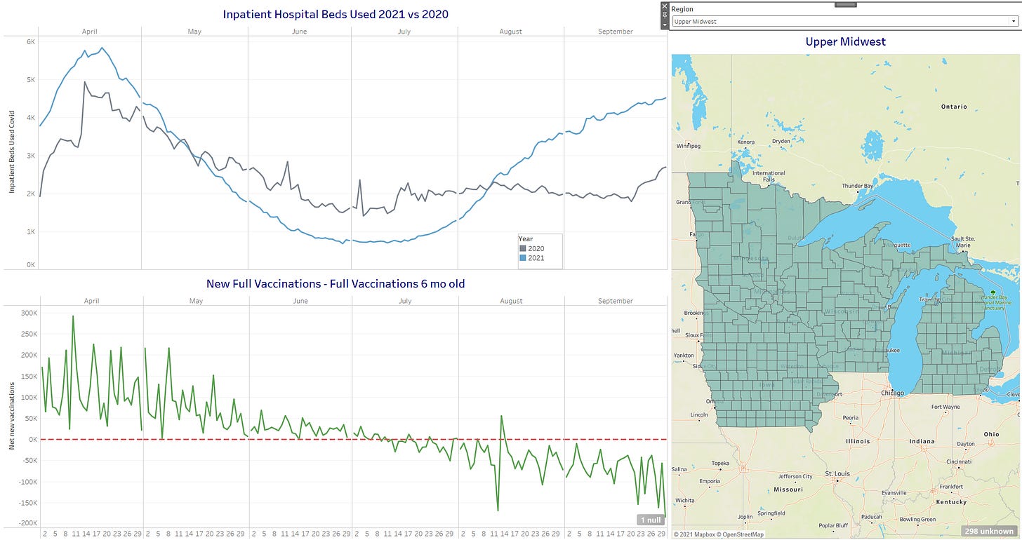
Obviously this is just a hypothesis, but it seems one that is consistent with the data. Perhaps we were able to prevent sickness in people for several months, only to have them “re-enter” unprotected status later. Below are charts for different regions where I believe you can see similar interesting patterns.
** UPDATE: This data visualization is now available as the last tab of the Tableau Public workbook I’ve published with a variety of data.


Would you say this is an argument for boosters, then?
Typically flu seasonal deaths are higher one year, lower the next, then higher, etc. Likely due to immune boosting from the prior year, and death of the most susceptible. Measles had a 3-4 year cycle like this, with low prevalence while the pool of susceptible young kids increased.
So two years of high excess deaths is highly unusual, if due just to the SARS-Cov-2 virus.
I wonder if the excess deaths in both years are due to the virus spike protein: from infection in 2020, from the vaccines in 2021. Any ideas about how to confirm or refute this?