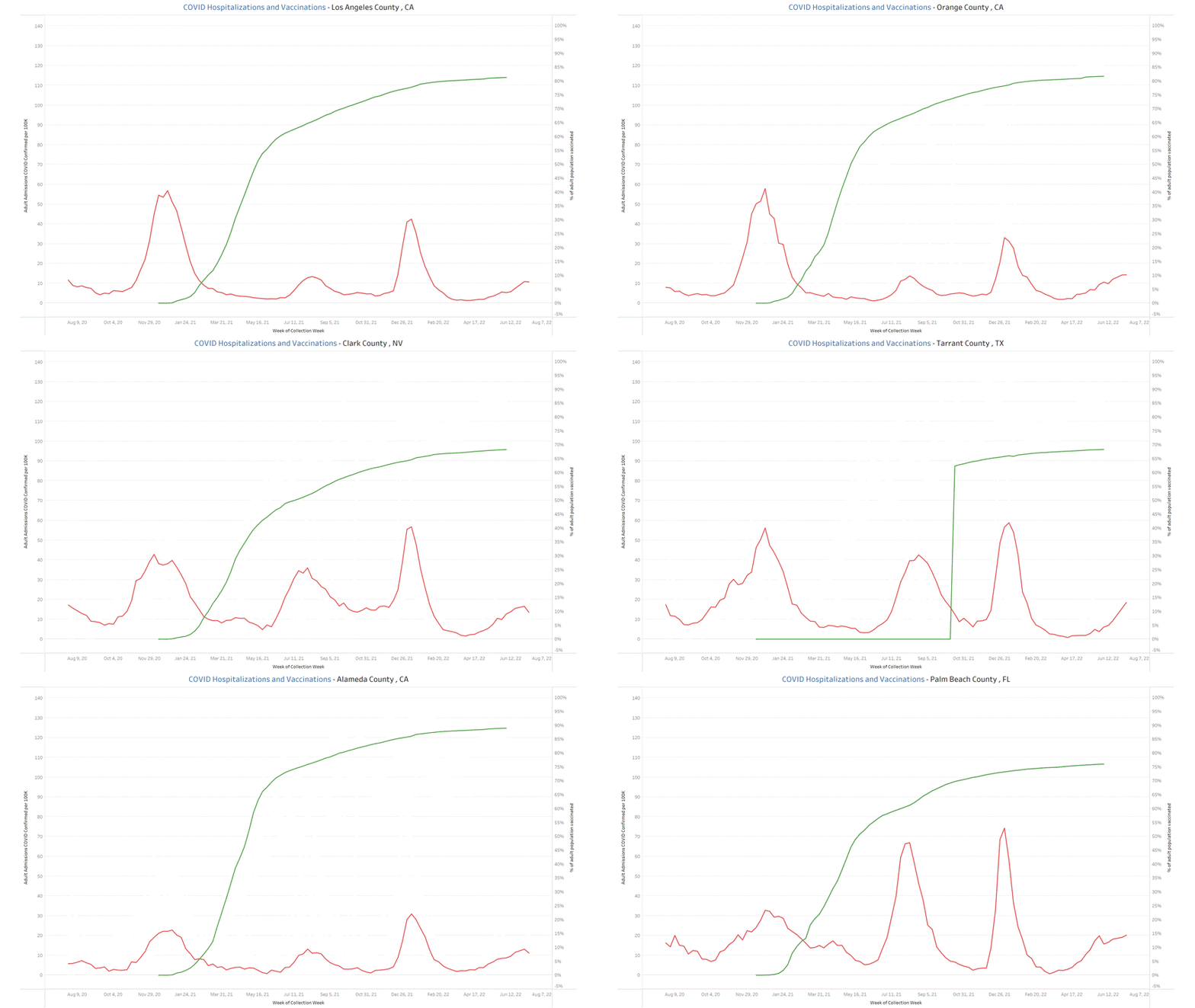
The US does not directly report COVID hospitalization rates by US county (as far as I know). The hospitalization data sets they provide include state level reporting and facility level reporting. These are what I use for the dashboards I create. Because some counties are too small to have hospitals, that means we would not be able to cleanly identify how many hospitalizations there are for those counties. In very large counties, that should not be much of a problem. While there may be residents of a large county who seek treatment at a hospitals outside that county (and residents of another county who seek treatment within the large county), for the most part the data from the hospitals within a given county should be pretty accurate representation of that county.
With that being said, I took a look at hospitalizations and vaccinations over time within the top 25 US counties by population (Los Angeles, CA of ~10MM people down to Palm Beach, FL of ~1.5MM people). I plotted the number of COVID-confirmed adult admissions to hospitals per 100K population (source: HealthData.gov) and the% of adult population fully vaccinated (source: CDC for vax , USAFacts.org for population).
Rather than pasting 25 plots, I created my 1st gif 😁. Green lines are vaccinations, red lines are covid confirmed hospitalizations. Let me know what you think & if you think it is effective at telling a story. Quick note- Seems like TX did not report vaccination by county into fall of 2021, so those lines will look funny for TX counties.


Hard to tell what you are trying to prove. I’m not saying it’s not accurate, but I wouldn’t forward this to anyone as proof of anything. Just not a compelling presentation. But I 100% support the effort you continue to put in to showing what is actually going on. Thank you so much for all your effort.
Good snapshot, layer in excess mortality if possible.