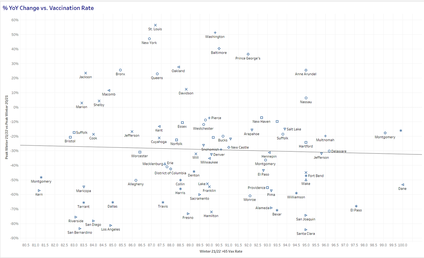
In the comments of my 1st post on this topic, reader Nicholas asked whether the analysis would look different if we used the % of 65+ population vaccinated instead of 18+ population. In the past, I have found this did not matter too much as those rates tended to move together in lockstep (i.e. places with high vaccination rates were high across age groups). Here is the scatter plot, using the % 65+ population vaccinated:
While the best fit line does slope down towards the right (which would indicate higher vaccine counties improved more YoY), the relationship would not be considered statistically significant (R^2~0.04, p-value~0.07). In addition, we can see that we have 3 points which look to be “high leverage” points:
This means that these points are having a large influence on the slope of the best fit line. If we remove those 3 points, we have:
In this view, there is clearly no significant relationship (R^2~0.002, p-value~0.71). In summary, I don’t believe the picture changes when we consider vaccinations only of seniors vs. vaccinations of all adults.


Anything significant about those three counties? Sometimes the outliers reveal more important information about the underlying factors than the norms do.
Great, thanks. But does this mean that vaccination had no effect at all on mortality? The YoY change depends on other factors, too, like the level in 2020 prior to vaccination (hard to improve if 2020 was mild), the timing and composition (delta/omicron) of the 2021/22 winter wave, and also the booster rate. What about the booster rate? :)